
Warm Light vs. Cool Light: How Bulb Color Temperature Changes a Room's Entire Mood

Key Takeaways
- Color temperature is measured in Kelvins (K) - lower numbers mean warmer, more amber light; higher numbers mean cooler, bluer light.
- Warm bulbs (2700K-3000K) promote relaxation and suit social or rest spaces like living rooms and bedrooms.
- Cool bulbs (4000K-6500K) support focus and visibility, making them well-suited for task-heavy areas.
- Matching light temperature to a room's purpose is one of the simplest, most affordable ways to improve a home's feel.
- Layering multiple light sources at different temperatures within one room gives you flexibility and depth.
Option A
Warm Light (2700K-3000K)
The cozy, inviting classic.
Best for: Living rooms, bedrooms, and dining areas where relaxation and comfort are the priority.
Option B
Cool Light (4000K-6500K)
The crisp, energizing alternative.
Best for: Kitchens, home offices, garages, and bathrooms where clarity and alertness matter most.
If you want a living room that feels relaxing and welcoming
Warm Light (2700K-3000K)
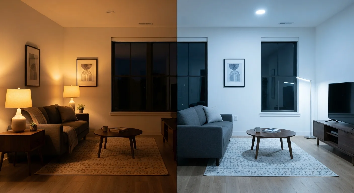
Warm amber tones mimic the softness of candlelight, putting people at ease and making a room feel lived-in rather than clinical.
If you need sharp visibility for cooking, crafting, or close-up work
Cool Light (4000K-6500K)
Cool, brighter light reduces eye strain during detail-oriented tasks and makes surfaces and colors easier to distinguish accurately.
If you work from home and need to stay focused throughout the day
Cool Light (4000K-6500K)
Cooler temperatures are associated with alertness and cognitive engagement, helping maintain concentration over long periods.
If you want a bedroom that feels calm and wind-down ready
Warm Light (2700K-3000K)
Soft warm light in the evening supports a natural transition toward sleep by avoiding the stimulating effect of blue-spectrum light.
If you want one lighting setup that works for multiple activities
Warm Light (2700K-3000K)
Warm-dimmable bulbs offer the widest comfort range across social, restful, and ambient uses, making them the most versatile everyday choice.
What Color Temperature Actually Means
When you flip a bulb package over and see a number like 2700K or 5000K, that number refers to color temperature - a measure, in Kelvins (K), of the hue a light source emits. Despite the word "temperature," it has nothing to do with heat output. It describes color quality only.
The scale works counterintuitively: lower Kelvin numbers produce warmer, more orange-yellow light, while higher numbers produce cooler, bluish-white light. Think of a candle flame (roughly 1800K) at one end, and a clear midday sky (around 6500K) at the other.
Most residential bulbs fall within three broad ranges:
- Soft white / warm white (2700K-3000K): Amber and golden tones, closest to incandescent bulbs.
- Neutral / bright white (3500K-4000K): A balanced middle ground - less cozy than warm, less stark than cool.
- Daylight (5000K-6500K): Crisp blue-white light that mimics natural outdoor daylight.
Understanding this spectrum is the first step to making intentional lighting choices - no design degree required.
| Criterion | Warm Light (2700K-3000K) | Cool Light (4000K-6500K) |
|---|---|---|
| Color appearance | Amber / golden yellow | Bright white / blue-white |
| Mood created | Cozy, relaxed, intimate | Alert, crisp, energized |
| Best rooms | Living room, bedroom, dining | Kitchen, office, bathroom, garage |
| Color accuracy | Lower - warm tones shift hues | Higher - colors appear truer |
| Evening use | Supports natural wind-down | May interfere with relaxation |
| Task suitability | Limited for detail work | Well-suited for focused tasks |
| Perceived room size | Feels smaller, more enclosed | Feels larger, more open |
How Each Temperature Changes a Room's Mood
Lighting doesn't just help you see - it shapes how a room feels. Warm light draws walls inward, creating intimacy. Cool light pushes boundaries outward, making spaces feel open and functional. Neither is objectively better; the right choice depends entirely on the room's purpose.
Warm light (2700K-3000K) softens edges, flatters skin tones, and creates an atmosphere that feels settled and unhurried. It's why restaurants and hotels lean heavily into amber lighting - it puts people at ease. In a home context, it works beautifully in living rooms, bedrooms, and dining spaces where the goal is comfort over performance.
Cool light (4000K-6500K) has a sharper, more energizing quality. Colors appear more accurate under it, which matters in a kitchen when you're checking whether meat is cooked through, or in a bathroom when applying makeup. It can feel sterile in living areas but excellent in utility-focused spaces like laundry rooms, home offices, and garages.
2700K
Kelvin rating of a standard incandescent bulb
The incandescent bulb served as the baseline for warm light for over a century, and most warm LED bulbs are designed to replicate its output.
~6500K
Color temperature of midday outdoor daylight
Daylight-rated bulbs approximate outdoor noon light, which is why they can feel stark indoors when used in living spaces.
3
Main residential color temperature ranges
Soft white, neutral white, and daylight cover the vast majority of residential bulb options available in hardware and home stores.
Just as the colors on your walls interact with each other - something explored in our guide to using the color wheel for home décor - your light temperature interacts with your paint, furniture, and fabrics in ways that can either amplify or undercut your intended look.
Room-by-Room Lighting Guidance
Applying color temperature thoughtfully doesn't require rewiring anything. Standard screw-in LED bulbs now come in every temperature range, and most are clearly labeled on the box.
Living Room
Warm (2700K-3000K) is the default choice here. Layer floor lamps, table lamps, and wall sconces for depth rather than relying on one overhead fixture. Dimmable warm bulbs give you the most flexibility across evening conversations, movie nights, and reading.
Bedroom
Stick with warm (2700K). Cooler light in the hour before bed can interfere with the body's natural wind-down signals. Keep bedside lighting soft and pointed away from your face.
Kitchen
Neutral to cool (3500K-4500K) works well for overhead and under-cabinet task lighting, where accuracy matters. You can warm up a breakfast nook or kitchen island with lower-temperature pendants if the space also serves as a gathering spot.
Home Office
Neutral to cool (4000K-5000K) supports sustained concentration. Mimic natural daylight as closely as possible, especially if your workspace lacks windows.
Bathroom
Neutral (3500K-4000K) near the vanity gives the most accurate reflection for grooming tasks without the harshness of full daylight bulbs.
A Note on CRI and Dimmer Compatibility
Color temperature isn't the only spec worth checking. CRI (Color Rendering Index) measures how accurately a bulb renders the true colors of objects - a score of 90+ is considered high quality. Additionally, not all LED bulbs are dimmable; if you plan to use a dimmer switch, look specifically for bulbs labeled "dimmable" to avoid flickering or buzzing. Always verify bulb compatibility with your existing dimmer hardware before purchasing.
Mixing Temperatures: The Layered Lighting Approach
One of the most effective - and overlooked - home lighting strategies is intentionally mixing temperatures within a single room. Rather than installing uniform overhead lighting and stopping there, consider what designers call layered lighting: combining ambient, task, and accent sources at different heights and, sometimes, different temperatures.
For example, a kitchen might use 4000K overhead recessed lighting for general visibility, paired with 2700K pendants over an island where family gathers in the evening. The contrast adds visual interest and lets the room shift its personality based on the activity happening in it.
In open-plan homes where the living and dining areas share one space, this layered approach allows each zone to maintain its own mood without hard architectural separation. The key is keeping transitions gradual - avoid placing a 2700K lamp directly next to a 6500K fixture, as the contrast can feel jarring rather than intentional.
This kind of thoughtful layering is a low-cost way to dramatically change how a room reads - and it requires nothing more than choosing bulbs mindfully the next time one burns out.