

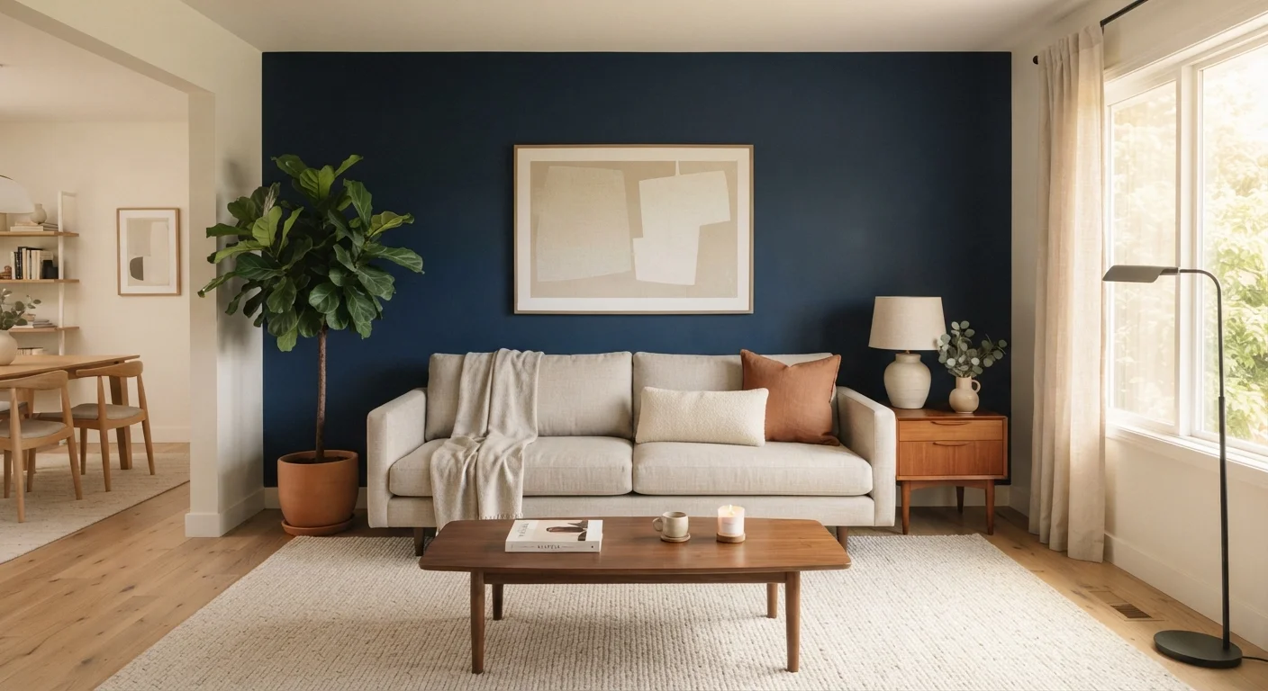
Key Takeaways
- Accent walls work best when they emphasize a wall that already has architectural importance.
- Color contrast, pattern scale, and room proportions all determine whether an accent wall succeeds.
- The focal wall should draw the eye naturally - not compete with furniture or other décor.
- Pattern-based accent walls require more planning than painted ones to avoid visual clutter.
- Lighting conditions in your specific room should influence your color or pattern choice.
Why Accent Walls Work - and When They Don't
An accent wall is one of the most accessible tools in home decorating: relatively low cost, reversible, and capable of transforming a flat room into a cohesive space. But the same quality that makes it approachable - a single can of paint or a roll of wallpaper - also makes it easy to misapply. A poorly placed accent wall can make a room feel choppy, a ceiling feel lower, or a small space feel smaller.
The principle behind a successful accent wall is intentional contrast. The treated wall should stand apart clearly from its surroundings while still belonging to the same visual story. When contrast is too weak, the wall looks unfinished. When it's overdone without coordination, it competes with everything else in the room.
If you're approaching home décor from scratch, a room-by-room decorating framework can help you place an accent wall within the broader plan rather than treating it as a standalone decision. It's also worth checking whether any assumptions you're carrying about color and room size are actually holding you back - some common design rules do more harm than good.
Best Practices for Placing and Designing an Accent Wall
The practices below reflect widely shared interior design principles. Use them as a framework for your own space rather than a rigid checklist - every room has different proportions, light conditions, and existing furnishings that will shape the right approach.
Choose the wall your eye lands on first when entering the room.
An accent wall reinforces what the eye already treats as the room's visual anchor. Fighting that natural instinct creates tension rather than balance. Selecting the obvious focal wall ensures the treatment feels intentional rather than arbitrary.
Pick a color at least two or three shades deeper or more saturated than your existing palette.
Insufficient contrast is the most common reason accent walls fall flat. If the accent color is too close to the surrounding walls, it reads as a mistake rather than a deliberate design choice. Contrast is what gives the wall its visual weight.
Scale your pattern to the size of the wall, not personal preference.
A large-scale botanical or geometric print can overwhelm a small bedroom wall, while a fine repeating pattern can disappear entirely on a wide open-plan wall. Matching pattern scale to physical scale keeps the room feeling proportionate. Refer to color theory basics to also make sure pattern hues coordinate with your existing palette.
Avoid walls broken up by multiple doors, windows, or outlets.
Interruptions fragment the treatment and diminish its impact. Each break in the wall surface pulls the eye away from the design, making even a beautiful pattern feel disjointed. A largely uninterrupted wall surface gives the treatment room to breathe.
Evaluate the wall under your room's actual lighting before committing.
Colors and patterns behave differently under natural daylight, warm incandescent light, and cool LED fixtures. A hue that looks dramatic in a paint chip can wash out under bright overhead lighting, or feel oppressive in a north-facing room with limited natural light.
Limit the accent treatment to one wall per room.
Two accent walls in a single room split the focal point, creating visual competition instead of emphasis. The effect of a single strong wall depends on contrast with the surrounding surfaces - multiply it, and the contrast disappears. If you're tempted to do more, consider whether a gallery wall arrangement on one surface might give you the layered effect you're after.
Renting? Temporary Options Exist
If you rent your home, a painted accent wall may not be an option. Removable wallpaper, fabric wall panels, and peel-and-stick tile sheets can create a similar focal-point effect without permanent changes. Always review your lease and check with your landlord before making any wall modifications.
Quick Wins: Start Here Before You Buy a Drop Cloth
Before purchasing paint or wallpaper, a few low-effort steps can confirm whether your instincts are pointing you in the right direction - or save you from an expensive repaint.
“Color does not add a pleasant quality to design - it reinforces it.”
— Pierre Bonnard, Post-Impressionist painter and decorative artist
Once you're confident in your placement and color direction, understanding the color wheel will help you choose a hue that works with - rather than against - the rest of your palette. And if you're wondering whether your existing décor is simply due for a refresh, these signals can help you decide.