

Key Takeaways
- Furniture does not need to match - mixing pieces adds character and visual interest.
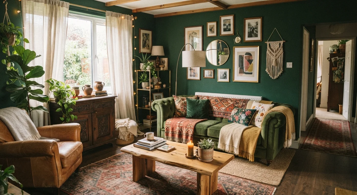
- Dark colors can actually make a small room feel cozier and more intentional, not smaller.
- Rugs in small rooms should be larger than instinct suggests, not smaller.
- Contrast and variation in texture are what prevent a room from looking flat and lifeless.
- Personal style and function matter more than following conventional decorating rules.
Why These Rules Stick Around
Most decorating "rules" started as shortcuts - practical guidance for people furnishing homes quickly or without much guidance. Over time, they calcified into gospel. Magazines repeated them, furniture showrooms reinforced them with perfectly matched room sets, and well-meaning relatives passed them down as fact.
The problem is that many of these rules actively work against the goal of a room that feels layered, personal, and alive. A space built entirely around matching pieces and pale neutrals may photograph cleanly, but it often feels like no one actually lives there. If your rooms feel flat or uninspired despite your best efforts, one of the myths below may be the culprit.
For a deeper look at why photographed spaces often disappoint in person, see why rooms that look great in photos feel empty in person.
Myth
All your furniture should match - same wood tone, same finish, same collection.
Fact
Matching furniture sets often make a room feel flat and impersonal. Intentional mixing creates depth and visual interest.
Furniture showrooms display matched sets because it simplifies merchandising - not because it produces the best-looking rooms. When every piece shares the same finish and era, the eye has nothing to move between. Interior designers routinely mix wood tones, metal finishes, and furniture periods precisely because contrast is what makes a room feel curated rather than staged. A vintage side table next to a modern sofa signals that someone actually lives there and has accumulated pieces they love over time. The key is finding a unifying thread - a repeated color, a consistent scale, or a shared material - rather than identical finishes. See how second-hand finds integrate into modern interiors for practical examples.
Myth
Small rooms should always use light, pale colors to make them feel bigger.
Fact
Dark, saturated colors can actually make small rooms feel more intentional and immersive - not cramped.
The logic behind this myth makes intuitive sense: light reflects more, so pale walls must open a space up. In practice, very pale rooms in small spaces often just look washed-out and unresolved. A deep navy, forest green, or terracotta can wrap a small room in a way that feels cozy and deliberate rather than cramped. What actually affects perceived size more than wall color is furniture scale, the amount of floor visible, and how much natural light enters. If you want to genuinely understand color's effect on a room, this plain-language color guide covers the fundamentals without jargon.
Myth
In a small room, use a small rug so it doesn't overwhelm the space.
Fact
Undersized rugs are one of the most common decorating missteps - a larger rug typically makes a room feel more grounded and spacious.
A rug that's too small floats awkwardly in the center of a seating area, making the furniture look unanchored and the room feel disjointed. In most living rooms, the front legs of all major seating pieces should sit on the rug, if not all four legs of each piece. This anchors the arrangement and defines the zone clearly. The instinct to "scale down" in small spaces often backfires - a properly sized rug draws the room together and actually makes the perimeter feel larger by contrast. For more on furniture arrangement logic in compact spaces, see arranging furniture when square footage is tight.
Myth
Every room needs a focal point, and it should always be the largest wall.
Fact
A focal point works best when it's where the eye naturally lands upon entering - which is often not the largest wall.
The purpose of a focal point is to give a room a visual anchor - a place the eye settles first and returns to. That's most effective when it aligns with the natural sightline from the entry point, not simply the biggest surface available. A fireplace, a well-placed piece of art, or even a striking plant arrangement can serve this role on a side or angled wall. Forcing a focal point onto the largest wall can actually flatten a room by pulling focus away from its natural geometry. For guidance on where color and pattern create the most impact, accent walls done right explains the thinking behind placement decisions.
Myth
Decorating a room means buying everything new and starting fresh.
Fact
Rooms that feel most personal and layered typically include a mix of old and new, accumulated over time.
The pressure to furnish a room all at once - usually driven by budget constraints or moving timelines - often leads to spaces that feel generic. Professionally decorated rooms almost always include inherited pieces, thrifted finds, or objects collected during travel, mixed with newer purchases. This accumulation is precisely what gives a room personality. Starting with a few quality anchor pieces and layering in over time produces better results than buying a complete set immediately. If you're beginning from scratch, a complete framework for decorating from scratch can help you prioritize without overspending.
Putting Corrected Thinking Into Practice
Letting go of these myths doesn't mean throwing out all structure. It means replacing rigid rules with flexible principles: contrast over uniformity, scale over instinct, and cohesion over matching. A room feels finished when its elements relate to each other - not when they're identical.
60%+
Of rooms feel unfinished due to undersized rugs
Interior design professionals frequently cite rug sizing as the single most common and correctable mistake in residential spaces.
3-5
Texture types recommended per well-designed room
Design educators generally suggest combining at least three to five distinct material textures to achieve visual depth without added color or pattern.
Texture is one of the most underused tools. Combining smooth surfaces (glass, lacquer, metal) with soft or rough ones (linen, wood, woven baskets) gives the eye something to travel across, which is what creates the sense of depth that matched furniture sets typically lack. Our guide to layering rugs, throws, and cushions walks through exactly how to do this without cluttering a space.
Color decisions deserve similar rethinking. If you're working with a small or oddly shaped room, a plain-language color guide can help you choose a palette based on effect rather than fear. And if your space has outgrown its current style, these signals suggest where to start a refresh without spending a lot.
Don't Redesign Everything at Once
Changing too many elements simultaneously makes it difficult to understand what's working and what isn't. Adjust one variable at a time - wall color, rug size, or furniture arrangement - so you can assess the effect clearly before moving on. Rooms benefit from gradual, intentional editing, not wholesale overhauls done under pressure.
Budget isn't a barrier to getting this right. Second-hand and vintage pieces are often the easiest way to introduce the mix of eras and materials that makes a room feel genuinely curated rather than catalog-assembled.