

Key Takeaways
- A gallery wall works best when it has a unifying element - color, frame finish, or subject matter - that ties pieces together.
- Consistent spacing (typically 2-3 inches between frames) creates visual order without making the arrangement feel rigid.
- Planning your layout on the floor before hanging anything prevents unnecessary nail holes and repositioning.
- Mixing frame sizes and shapes adds energy; mixing too many styles without a connector creates visual noise.
- A gallery wall doesn't require matching frames or expensive artwork - cohesion comes from curation, not cost.
Gallery Wall
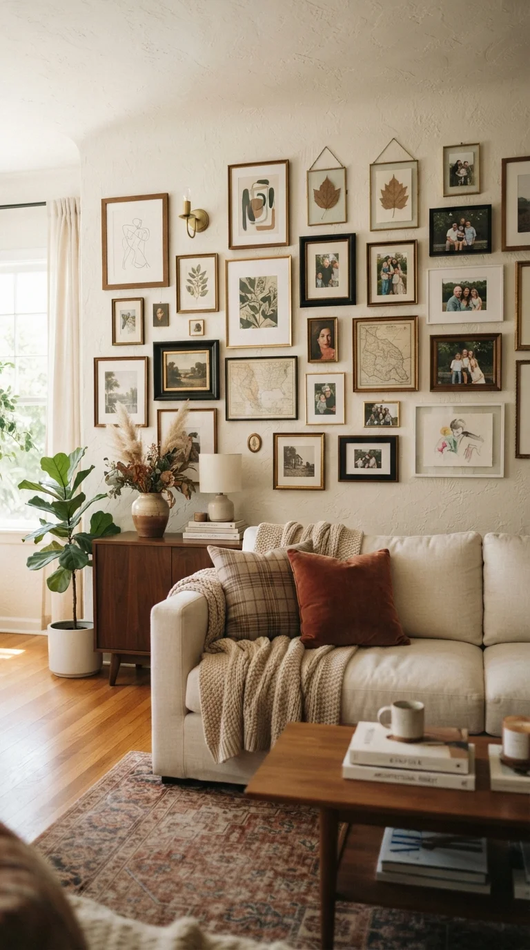
A gallery wall is a curated grouping of framed artwork, photographs, prints, or decorative objects arranged together on a single wall to create a unified visual display. Unlike hanging pieces individually, a gallery wall treats the entire wall surface as a canvas - using scale, spacing, and variety to tell a cohesive story. It's a flexible approach that works in virtually any room and at almost any budget.
In interior design, a gallery wall is sometimes called a salon-style wall, referencing the 17th-century European practice of stacking paintings floor-to-ceiling in art salons. Modern interpretations are far more relaxed and personal.
What Makes a Gallery Wall Work
A gallery wall isn't just a cluster of frames - it's a composition. The difference between an arrangement that looks intentional and one that looks haphazard usually comes down to three things: a unifying thread, balanced spacing, and a relationship to the room around it.
The unifying thread is your first decision. It could be a shared frame color, a consistent mat (the border inside the frame), a common subject like botanicals or family portraits, or even a limited color palette across the artwork itself. You don't need all three - one strong connector is enough to make mixed sizes and styles feel deliberate rather than random.
If you're decorating a room that already has a focal point, see how our piece on choosing the right accent wall approaches visual anchoring - many of the same principles apply.
Test Your Unifying Thread First
Before collecting frames, hold two or three candidate pieces next to each other in the actual room. Natural light and wall color affect how finishes and artwork read. A matte black frame and a dark walnut frame may look similar in a store but feel disconnected on your wall. A quick visual test saves both time and money.
The Building Blocks: Frames, Artwork, and Fillers
A gallery wall is typically made up of three types of pieces working together:
- Anchor pieces: One or two larger frames (typically 16×20 inches or bigger) that give the arrangement its visual weight. These usually sit near the center or slightly off-center of the grouping.
- Mid-size pieces: Frames in the 8×10 to 11×14 range that fill in around the anchors. These carry most of the visual storytelling - artwork, prints, and photos live here.
- Fillers: Smaller pieces, objects, or decorative elements (mirrors, wall-hung shelves, small clocks, or 4×6 prints) that complete the composition and prevent awkward gaps.
The artwork itself can be anything that reflects your taste - printed photos, downloaded art prints, pages from an old calendar, fabric samples in a frame, or pieces picked up at a local market. The frame does most of the work of making something look intentional.
57-60 in
Recommended gallery wall center height from floor
Interior designers generally align the visual midpoint of a wall arrangement with average standing eye level, around 57 to 60 inches from the floor.
2-3 in
Ideal spacing between frames
A gap of 2 to 3 inches between frames is a commonly cited guideline in home décor and interior design references for maintaining visual cohesion.
6-8 in
Clearance above furniture beneath the wall
Leaving 6 to 8 inches between the top of a sofa or console and the lowest frame in an arrangement is a standard interior design practice for visual balance.
Planning the Layout Before You Hang Anything
The single most useful step most people skip is laying the entire arrangement out on the floor before touching a nail. Trace each frame onto paper, cut out the shapes, and tape them to the wall with painter's tape. Step back, live with it for a day, and adjust. It costs nothing and prevents a wall full of test holes.
When planning your layout, aim to keep the outer edges of the arrangement roughly rectangular - an overall shape that the eye can read easily. Inside that shape, vary the frame sizes and orientations (portrait and landscape) to create rhythm. Avoid lining up all the frames in a strict grid unless a very structured, symmetrical look is your goal.
For rooms with limited wall space, this kind of intentional spatial thinking overlaps with furniture arrangement strategy. Our guide on arranging furniture in small rooms covers the underlying logic of working within constraints.
Hanging with Confidence
Once your floor plan is set, transfer it to the wall. A useful technique: tape paper cutouts to the wall, then hammer the nail right through the paper template and tear it away. This gives you accurate placement without measuring from scratch each time.
Keep a level handy - even small tilts are noticeable once everything is up. Most standard frames can hang from a single nail, but heavier frames (especially large canvases or mirrors) may need wall anchors rated for the appropriate weight. Check your wall type before hanging anything substantial; drywall, plaster, and masonry each require different hardware.
If you're in a rental or prefer not to use nails, adhesive hanging strips are a practical option - just verify the weight rating and follow the application instructions to protect your walls.
A gallery wall is also an easy way to put a design idea from our complete decorating framework into immediate practice - it's one of the fastest ways to make a blank room feel like yours.
Gallery Walls Evolve Over Time
One of the quiet advantages of a gallery wall is that it doesn't have to be finished all at once. Many people start with a handful of pieces and add to the arrangement over months or years as they find artwork they connect with. Designing the initial layout with a few intentional gaps makes it easier to grow the wall naturally without disrupting the overall composition.